Reduced Position Sticky
Last night I added a reduced motion media query for the header of the primary content of my website. I am using position: sticky (and position: -webkit-sticky for Safari) to make the content obscure the header, on scroll.
Since such behavior could be considered a form of parallax scrolling, I am cognizant of the fact it may be a triggering issue for some people. Therefore, I want to respect those who have opted to prefer reduced motion.
Adding prefers reduced motion media query
It’s rather simple to implement the media query, which respects the macOS system preference for reduced motion:
@media screen and (prefers-reduced-motion: reduce) {
  .article-header-class {
    position: relative; /* to negate sticky */
  }
}
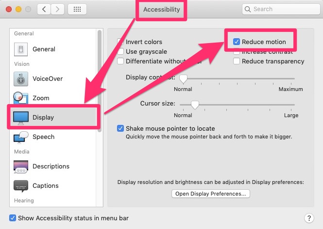
Enabling this feature on macOS can be done by going to System Preferences, Accessibility, Display, and then checking the Reduced Motion checkbox.

With the media query in place, and the reduced motion checkbox checked, the header element is no longer sticky and scrolls away per standard functionality.
And some more info
I’d also recommend reading through through @patrick_h_lauke’s Twitter thread about reduced motion landing in Chrome Canary and what this setting might mean for Windows users.
prefers-reduced-motion query now in Chrome Canary https://t.co/u8fAsfjynk ... and at this stage worth pointing out that on Windows, many users MAY have inadvertently set their accessibility preference, but did so to disable Windows' own animations...
— patrick h. lauke (@patrick_h_lauke) March 11, 2019
